Dashboard Creation
Build professional interactive dashboards
What is a Dashboard?
A dashboard is a one-page summary that shows important information using charts and numbers.
Think of your car dashboard:
- It shows speed, fuel, temperature
- You see everything at one glance
- No need to read long reports
Excel dashboard does the same for your data!
Dashboard vs Report
| Feature | Dashboard | Report |
|---|---|---|
| Pages | One page only | Many pages |
| Shows | Charts and big numbers | Detailed tables |
| Updates | Can be interactive | Usually static |
| Purpose | Quick overview | Deep analysis |
Use a dashboard when your boss asks: "How are we doing?"
Parts of a Good Dashboard
Every dashboard has these parts:
| Part | What It Is | Example |
|---|---|---|
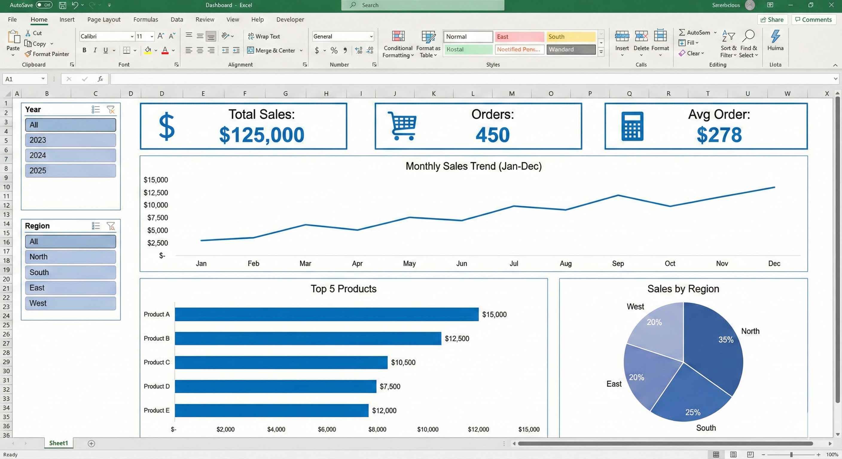
| KPI Cards | Big numbers showing key metrics | Total Sales: Rs 50,00,000 |
| Charts | Visual pictures of data | Bar chart, Line chart, Pie chart |
| Slicers | Buttons to filter data | Click 2024 to see only 2024 data |
| Tables | Small data tables for details | Top 10 products list |
Step 1: Plan Your Dashboard
Before making anything, answer these questions:
What do you want to show?
- Total sales this month?
- Which product sells most?
- Which region is best?
- How is the trend going?
Who will see it?
- Boss wants high-level summary
- Manager wants more details
- You decide what to include based on audience
Step 2: Prepare Your Data
Your data should be clean and organized.
Good data looks like this:
| Date | Product | Region | Sales |
|---|---|---|---|
| 01-Jan-2024 | Laptop | North | 50000 |
| 02-Jan-2024 | Mouse | South | 2000 |
| 03-Jan-2024 | Keyboard | East | 3500 |
| 04-Jan-2024 | Monitor | West | 25000 |
Make sure:
- No empty rows in between
- Column headers in first row
- Dates are in date format
- Numbers are in number format
Step 3: Create a New Sheet for Dashboard
Step 1: Right-click on any sheet tab at bottom
Step 2: Click "Insert" and choose "Worksheet"
Step 3: Rename it to "Dashboard"
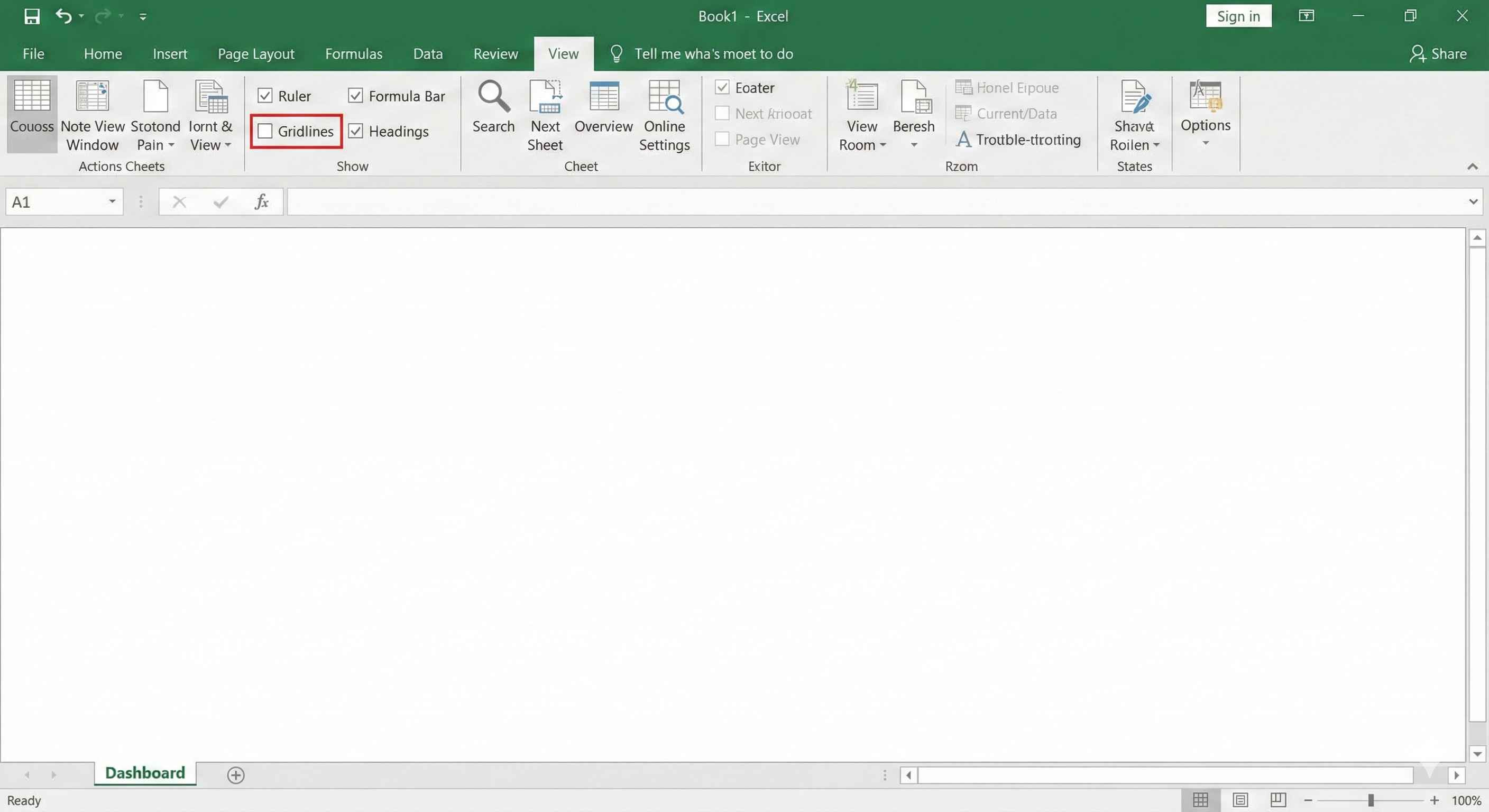
Step 4: Go to View tab and uncheck "Gridlines"
Now you have a clean white canvas!
Step 4: Create KPI Cards
KPI means Key Performance Indicator. These are big numbers that show important metrics.
How to make a KPI card:
Step 1: Insert a Rectangle shape (Insert > Shapes > Rectangle)
Step 2: Make it look nice:
- Fill color: Light blue or any color
- No outline or thin outline
- Round corners if you want
Step 3: Add a text box inside with your formula:
=SUM(Sales[Amount])
Step 4: Format the number to be big and bold
Example KPI Cards:
| KPI Name | Formula | Shows |
|---|---|---|
| Total Sales | =SUM(Sales[Amount]) | Rs 50,00,000 |
| Total Orders | =COUNT(Sales[OrderID]) | 1,250 |
| Average Order | =AVERAGE(Sales[Amount]) | Rs 4,000 |
Step 5: Create Charts
For showing trends (Line Chart):
Step 1: Select your monthly data
Step 2: Insert > Charts > Line Chart
Step 3: Move it to your Dashboard sheet
Step 4: Remove extra stuff:
- Delete chart title (you will add your own)
- Remove gridlines
- Remove legend if only one line
For comparing categories (Bar Chart):
Step 1: Create a PivotTable first (sales by product)
Step 2: Select the PivotTable
Step 3: Insert > Charts > Bar Chart
Step 4: Move to Dashboard and clean up
Step 6: Add Slicers for Filtering
Slicers let users click buttons to filter all charts at once.
How to add slicers:
Step 1: Click on any PivotTable
Step 2: Go to PivotTable Analyze tab
Step 3: Click "Insert Slicer"
Step 4: Choose what to filter by:
- Year
- Region
- Product Category
Step 5: Move slicers to left side of dashboard
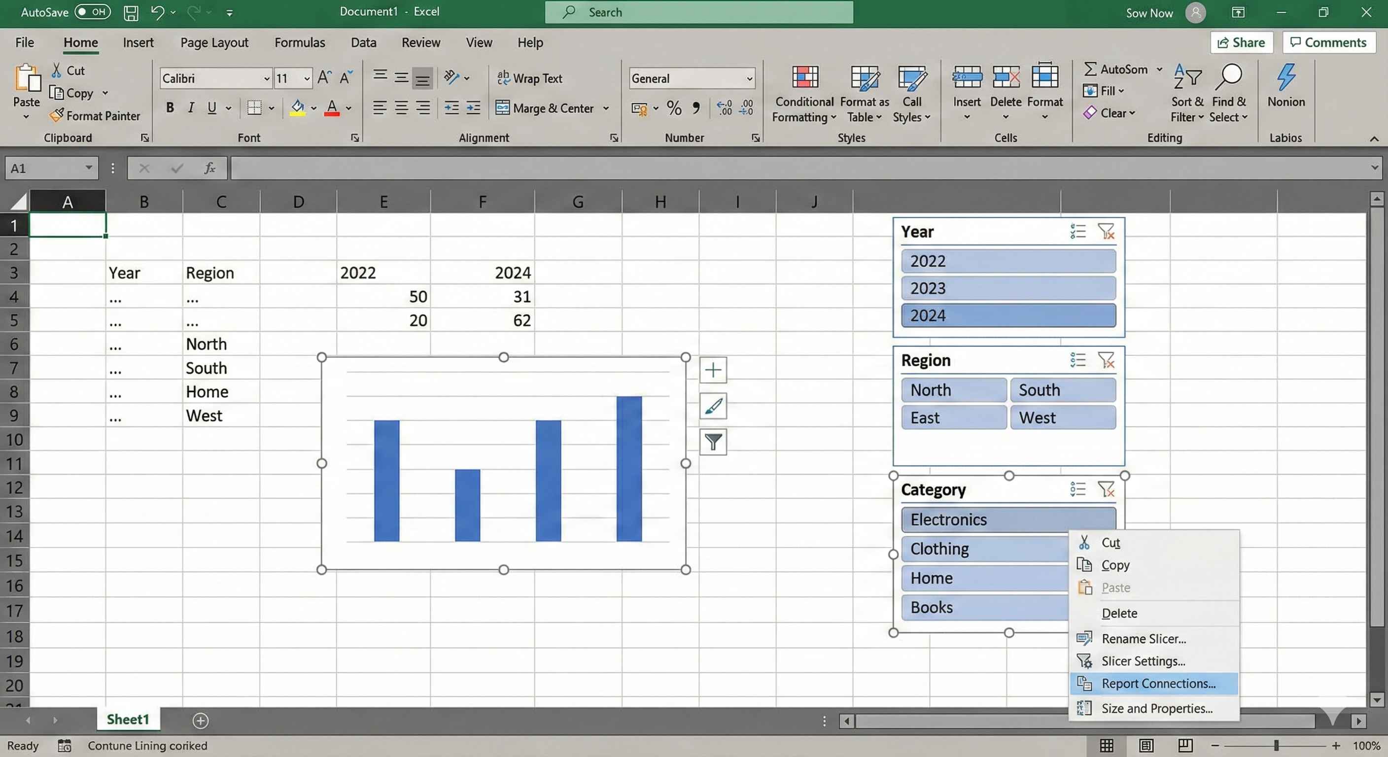
Step 7: Connect Slicers to All Charts
This is important! You want one slicer to filter ALL charts.
Step 1: Right-click on the slicer
Step 2: Click "Report Connections"
Step 3: Check ALL PivotTables that you want to filter
Step 4: Click OK
Now when you click "North" in the slicer, all charts show only North region data!
Step 8: Arrange Everything Nicely
Good layout rules:
| Position | What to Put |
|---|---|
| Top | Title and KPI cards (most important) |
| Left side | Slicers (filters) |
| Center | Main big chart |
| Bottom | Supporting smaller charts |
Alignment tips:
- Select multiple objects
- Go to Format tab
- Use Align options (Align Left, Align Top, etc.)
Making Charts Look Professional
Remove unnecessary things:
- Delete gridlines inside charts
- Remove chart borders
- Use same font everywhere (Calibri or Arial)
- Use same colors for same categories
Good color rules:
- Green = Good / Positive
- Red = Bad / Negative
- Blue = Neutral
- Use maximum 4-5 colors
Common Dashboard Mistakes
| Mistake | Problem | Solution |
|---|---|---|
| Too many charts | Confusing to look at | Use only 4-6 charts maximum |
| 3D charts | Hard to read values | Always use 2D charts |
| No slicers | Dashboard is static | Add slicers for interactivity |
| Tiny fonts | Cannot read | Use minimum 10pt font |
| Random colors | Looks unprofessional | Pick 3-4 colors and stick to them |
Dashboard Checklist
Before showing your dashboard to anyone, check:
- All charts update when you click slicers
- Numbers are correct (verify with source data)
- No gridlines visible on the sheet
- All text is readable
- Colors are consistent
- Title is clear
- Charts are aligned properly
Quick Tips
Tip 1: Remove sheet tabs
- Go to File > Options > Advanced
- Uncheck "Show sheet tabs"
- Now it looks cleaner
Tip 2: Add a refresh date
- Add a text: "Last Updated: "
- Next to it add formula: =TODAY()
- Now people know when data was refreshed
Tip 3: Lock the dashboard
- Review > Protect Sheet
- This prevents others from accidentally changing it
Key Points
- Dashboard = One page visual summary
- Always plan before building
- Use KPI cards for big important numbers
- Use charts to show trends and comparisons
- Add slicers so users can filter data
- Connect all slicers to all charts
- Keep it simple - maximum 5-6 charts
- Use consistent colors
- Remove gridlines and borders for clean look
Congratulations!
You have completed Module 4 - Advanced Excel!
You now know:
- Power Query (importing and cleaning data)
- Power Pivot (handling big data)
- Dashboard Creation (visualizing data)
Next module will have real-world projects where you apply everything you learned!