Module 6
8 min read
Chart Types Overview
Learn about different chart types and when to use them
What You'll Learn
- Different chart types in Power BI
- When to use each chart
- How to choose the right visual
Power BI Chart Types

Power BI offers many chart types. Here's when to use each:
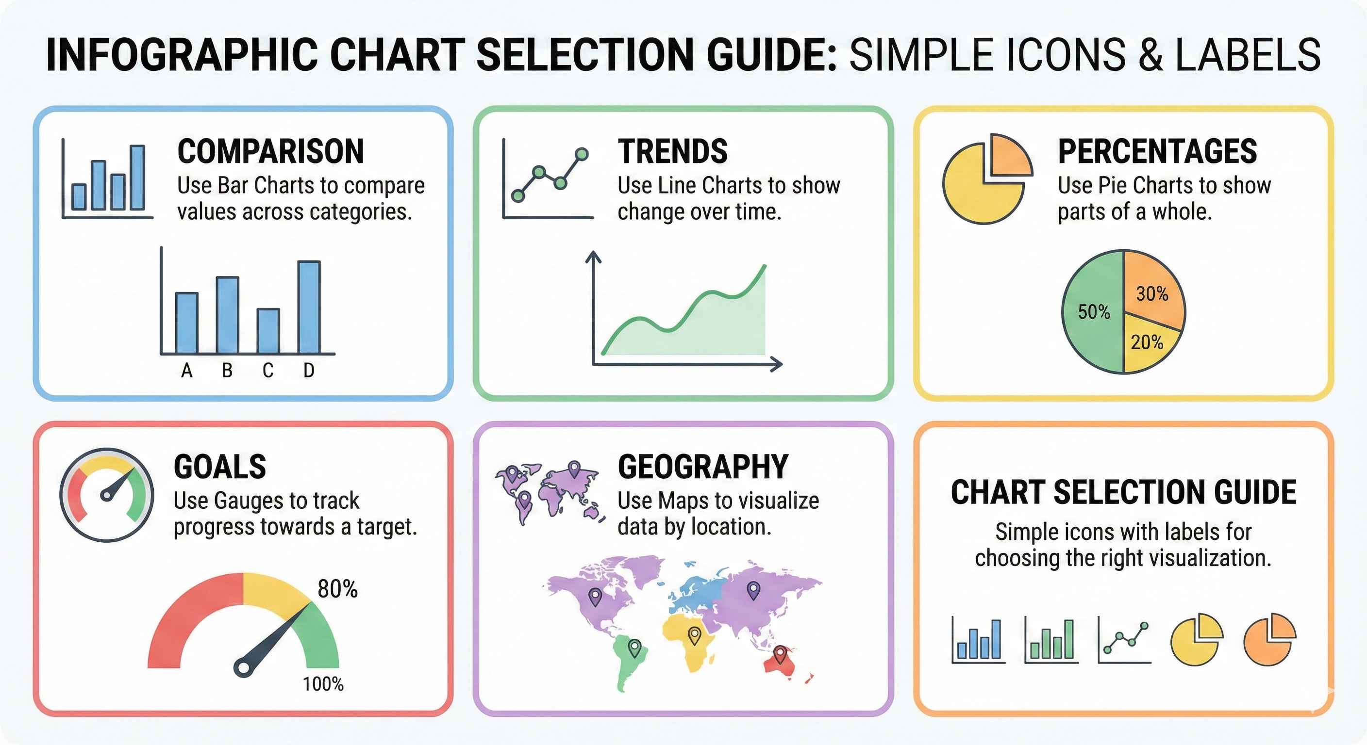
Bar & Column Charts
- Best for: Comparing categories
- Bar (horizontal): Long category names
- Column (vertical): Time-based data
- Examples: Sales by product, Revenue by region
Line Charts
- Best for: Trends over time
- Examples: Monthly sales, Growth trends
Pie & Donut Charts
- Best for: Parts of a whole (percentages)
- Rule: Use only 3-5 slices
- Examples: Market share, Budget split
Cards & KPIs
- Best for: Big important numbers
- Examples: Total Revenue, Customer Count
Tables & Matrices
- Best for: Exact numbers, detailed data
- Examples: Transaction lists, Reports
Scatter Charts
- Best for: Finding relationships between measures
- Examples: Price vs Sales, Profit vs Revenue
Maps
- Best for: Geographic data
- Examples: Sales by country, Store locations
Gauge Charts
- Best for: Progress toward a goal
- Examples: Sales target, Performance score
Treemap
- Best for: Hierarchical data
- Examples: Product categories, File sizes
Waterfall Charts
- Best for: Step-by-step changes
- Examples: Profit breakdown, Budget changes
Funnel Charts
- Best for: Process stages
- Examples: Sales pipeline, Conversion funnel
Quick Reference: Which Chart to Use?
| Goal | Best Chart |
|---|---|
| Compare categories | Bar/Column |
| Show trends | Line |
| Show percentages | Pie/Donut |
| Display key metrics | Card/KPI |
| Show exact data | Table/Matrix |
| Find correlations | Scatter |
| Geographic data | Map |
| Progress to goal | Gauge |
| Hierarchies | Treemap |
| Step changes | Waterfall |
| Process stages | Funnel |
Best Practices
Do:
- Keep it simple
- Use consistent colors
- Start bar charts at zero
- Limit to 5-7 visuals per page
Don't:
- Use 3D effects
- Use pie for many categories
- Clutter with too many colors
Try This
Create a simple dashboard:
- Card → Total Sales
- Bar Chart → Sales by Product
- Line Chart → Monthly Trend
- Pie Chart → Sales by Region
Tip: When unsure, use a bar chart. It works for almost everything!